Table of Contents
- What Is Color Grading and Why Does It Matter?
- Color Correction vs. Color Grading – Understanding the Difference
- Software Options for Color Grading
- Color Theory Basics Every Filmmaker Needs
- DaVinci Resolve Walkthrough – Your First Grade
- Reading and Using Video Scopes
- LUTs Explained – What They Are and How to Use Them
- Advanced Techniques – Power Windows, Qualifiers, and Nodes
- How to Achieve Common Cinematic Looks
- Key Takeaways
- Frequently Asked Questions
What Is Color Grading and Why Does It Matter?
Color grading is the process of altering and enhancing the color of a film, video, or image to create a specific visual tone and mood. If you have ever noticed that a horror film feels cold and desaturated while a romantic comedy feels warm and golden, you are seeing color grading at work. Learning how to color grade a film is one of the most impactful skills a filmmaker can develop because color directly influences how audiences feel about what they are watching.
Consider the difference between the raw, flat footage that comes out of a modern digital cinema camera and the final image you see on screen. Raw footage from a camera like the Blackmagic Pocket Cinema Camera 6K or the Sony FX6 looks washed out and lifeless by design – cameras capture flat, low-contrast images to preserve as much visual information as possible. The color grade is what transforms that technical starting point into the rich, emotional final image.
The impact of grading on audience perception is measurable. A study published in the Journal of Vision found that warm color temperatures in film scenes increased viewers’ perception of characters as trustworthy and approachable, while cool tones created feelings of distance and tension. Hollywood has understood this instinctively for decades – the orange and teal look that dominates blockbusters exists because orange (warm, human skin tones) and teal (cool, environmental contrast) create a pleasing visual tension that keeps eyes engaged.
The good news for beginners is that professional-quality color grading tools are now free. DaVinci Resolve, the industry standard, offers a fully functional free version that is used on Hollywood productions. The barrier to entry is knowledge, not cost.
Color Correction vs. Color Grading – Understanding the Difference
These terms are often used interchangeably, but they describe two distinct stages of the post-production color workflow. Understanding the difference is fundamental to learning how to color grade a film properly.
Color correction is the technical, objective first step. Its purpose is to make your footage look neutral and accurate. You are fixing exposure problems (too bright or too dark), correcting white balance (removing unwanted color casts from different light sources), matching shots so they look consistent within a scene, and ensuring skin tones look natural. Color correction answers the question: “Does this footage look like what our eyes would see in real life?”
Color grading is the creative, subjective second step. Once your footage is corrected and looks neutral, grading is where you push it in an artistic direction. You might warm up the highlights to create a nostalgic feeling, crush the blacks for a gritty look, or desaturate everything except a specific color for dramatic emphasis. Color grading answers the question: “How do I want this footage to feel?”
Always correct before you grade. Trying to apply creative grading to uncorrected footage is like trying to paint on a dirty canvas – the technical problems underneath will show through and undermine your creative choices. In DaVinci Resolve, this workflow is managed through nodes (which we will cover later), allowing you to keep correction and grading as separate, adjustable layers.
Software Options for Color Grading
Several software options exist for color grading, but the choice is more straightforward than you might think:
DaVinci Resolve (Free / $295 for Studio): The undisputed industry standard. DaVinci Resolve has been used to grade major films including Dune, La La Land, Moonlight, and Star Wars: The Last Jedi. The free version includes virtually all the color grading tools you need – the paid Studio version adds features like noise reduction, HDR grading, and multi-user collaboration. If you are serious about learning how to color grade a film, start here.
Adobe Premiere Pro ($22.99/month): Premiere’s Lumetri Color panel is capable of basic to intermediate grading. If you already edit in Premiere and your grading needs are modest, Lumetri can handle the job. It lacks the advanced node-based workflow and precision tools of DaVinci Resolve, but for YouTube content, short films, and social media video, it is perfectly serviceable.
Final Cut Pro ($299 one-time): Apple’s professional editor includes color wheels, curves, and basic grading tools. Like Premiere, it handles straightforward grading well but does not match Resolve’s depth. The Color Board and Color Wheels interfaces are intuitive for beginners.
FilmConvert Nitrate ($159): A plugin for Premiere, Final Cut, and Resolve that emulates the look of specific film stocks (Kodak Vision3, Fuji Eterna, etc.). Not a replacement for proper grading, but a useful creative tool that can give digital footage a more organic, filmic quality.
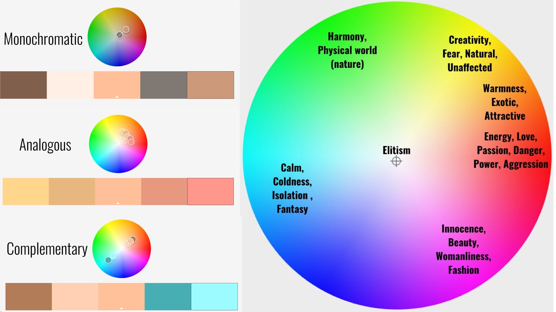
Color Theory Basics Every Filmmaker Needs
You do not need a fine arts degree to grade film, but understanding basic color theory will make your creative decisions more intentional and effective.
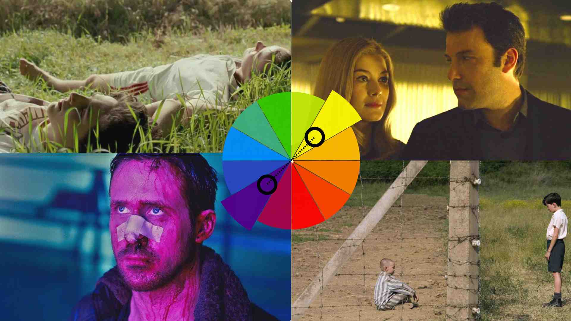
The color wheel: Colors opposite each other on the wheel are complementary – they create visual contrast and energy when placed together. Red and cyan, blue and orange, green and magenta are the three primary complementary pairs. The ubiquitous “teal and orange” look in blockbusters exploits the blue-orange complementary relationship.
Analogous colors: Colors adjacent on the wheel create harmony and cohesion. A grade that keeps everything in the warm spectrum (reds, oranges, yellows) feels unified and comfortable. Analogous palettes are common in romantic films and period dramas.
Color temperature: Measured in Kelvin (K), color temperature ranges from warm (lower K values, yellowish-orange) to cool (higher K values, bluish). Our brains associate warm tones with sunlight, safety, and intimacy, and cool tones with moonlight, technology, and clinical environments. Manipulating color temperature is the simplest and most powerful grading tool you have.
Saturation vs. vibrance: Saturation increases the intensity of all colors equally. Vibrance increases the intensity of muted colors while leaving already-saturated colors alone. Vibrance is usually the better choice for grading because it avoids over-saturating skin tones (which can look alien at high saturation levels).
DaVinci Resolve Walkthrough – Your First Grade
Here is a step-by-step guide to performing your first color grade in DaVinci Resolve. Download the free version from blackmagicdesign.com if you have not already.
Step 1: Import and set up your project. Open Resolve, create a new project, and import your footage via the Media page. Set your project timeline resolution (1920×1080 for HD, 3840×2160 for 4K) and frame rate to match your footage. Drag your clips to the timeline on the Edit page.
Step 2: Move to the Color page. Click the Color tab at the bottom of the interface. This is where DaVinci Resolve’s grading magic happens. You will see your timeline at the top, the viewer in the center, and the grading tools (color wheels, curves, scopes) below.
Step 3: Start with color correction. Select your first clip. Open the scopes (View > Scopes) and display the waveform monitor. Adjust the Lift wheel (shadows) to set your black point – the darkest part of the image should touch the bottom of the waveform without crushing. Adjust the Gain wheel (highlights) to set your white point – the brightest part should approach the top without clipping. Use the Gamma wheel (midtones) to adjust overall brightness.
Step 4: Fix white balance. If the image has a color cast (too warm, too cool, or greenish), use the temperature and tint sliders in the primary correction tools. Alternatively, use the eyedropper tool on something in the frame that should be neutral gray or white. Resolve will automatically adjust the white balance based on your selection.
Step 5: Add a creative grade. Right-click on the node tree and add a new serial node (Alt+S). This keeps your correction and creative grade separate. On this new node, push the colors in the direction you want. For a warm, nostalgic feel: add slight orange to the Gamma wheel and push the Gain wheel toward warm yellow. For a cold, tense feel: push Gamma toward blue-teal and reduce saturation slightly.
Step 6: Fine-tune with curves. The Curves panel gives you precise control. The Hue vs. Sat curve lets you increase or decrease saturation for specific colors (useful for making skies more vivid or calming down neon greens). The Hue vs. Hue curve lets you shift specific colors (turning a dull orange sunset into a rich golden one).
Reading and Using Video Scopes
Scopes are objective measurement tools that show you exactly what is happening in your image, independent of how your monitor displays it. Learning to read scopes is essential when learning how to color grade a film, because your eyes will lie to you – especially after staring at footage for hours.
Waveform monitor: Shows the brightness of your image from left to right, corresponding to the horizontal position in the frame. Values range from 0 (pure black) at the bottom to 1023 (pure white) at the top in a 10-bit signal. Use the waveform to set proper exposure – avoid letting values clip at the top or crush at the bottom.
Parade scope: Similar to the waveform but separates the red, green, and blue channels side by side. This is invaluable for identifying and correcting color casts. If the blue channel is consistently higher than red and green, your image has a blue color cast that needs correction.
Vectorscope: Shows the color distribution of your image on a circular display. Saturated colors push toward the outer edge; desaturated images cluster near the center. The vectorscope includes a skin tone indicator line – when grading people, your skin tone values should fall along or near this line regardless of the subject’s ethnicity.
Histogram: Shows the distribution of brightness values across your entire image. A well-exposed image typically shows a spread across the full range with gentle rolloff at both ends. A histogram bunched to the left indicates underexposure; bunched to the right indicates overexposure.
LUTs Explained – What They Are and How to Use Them
LUT stands for Look-Up Table. In practical terms, a LUT is a preset that remaps the colors in your footage according to a predefined formula. There are two types that serve very different purposes:
Technical LUTs (Input/Camera LUTs): These transform log or flat camera footage into a standard display format. When you shoot in S-Log3 (Sony), Log-C (ARRI), or BMDFilm (Blackmagic), your footage looks flat and desaturated because the camera is recording in a format designed to maximize dynamic range. A technical LUT converts this to Rec.709 (standard display) so the footage looks “normal.” This is a correction tool, not a creative choice.
Creative LUTs: These apply a predefined color grade – a “look” – to your footage. You can buy LUT packs from colorists like Juan Melara, Denver Riddle (Color Grading Central), and Buttery Films for $20-100. Creative LUTs can be a helpful starting point, but they should never be your entire grade. Apply a creative LUT, then adjust it to fit your specific footage.
The most common beginner mistake with LUTs is applying a creative LUT directly to uncorrected footage and calling it done. A LUT is designed to work on properly exposed, white-balanced footage. If your footage is underexposed or has a strong color cast, the LUT will amplify those problems rather than fix them. Always correct first, then apply the LUT, then fine-tune.
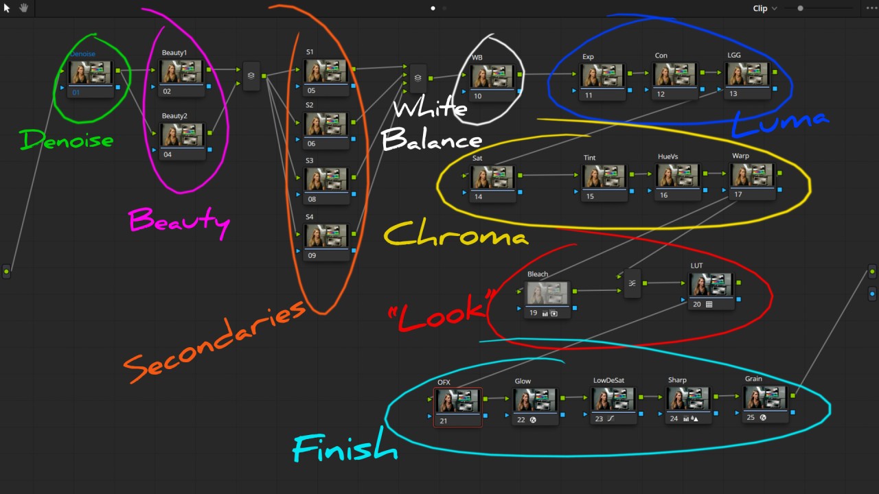
Advanced Techniques – Power Windows, Qualifiers, and Nodes
Once you are comfortable with primary corrections and basic creative grading, these intermediate tools will take your grades to the next level:
Power Windows: These are shapes (circles, squares, custom drawn paths) that isolate a specific area of the frame for targeted adjustments. Want to brighten just the subject’s face without affecting the background? Draw a power window around their face. Want to darken the sky without changing the foreground? Draw a graduated window across the top of the frame. Power windows with tracking (Resolve can automatically track the movement of your subject) are one of the most powerful tools in the colorist’s toolkit.
HSL Qualifiers: These let you select a specific color range for isolated adjustment. The most common use is skin tone isolation – select the skin tone range, then adjust it independently from the rest of the image. This is how colorists ensure skin always looks flattering regardless of what creative choices they make to the overall image.
Node-based workflow: DaVinci Resolve’s node system is what sets it apart from layer-based tools. Each node applies a specific adjustment, and nodes are connected in a chain. A typical professional node tree might look like this: Node 1 (exposure correction) – Node 2 (white balance) – Node 3 (creative grade) – Node 4 (skin tone isolation and correction) – Node 5 (sky enhancement via power window) – Node 6 (final contrast and saturation). This modular approach lets you adjust any single element without affecting the others.
How to Achieve Common Cinematic Looks
Here are simplified recipes for popular color grade styles. These are starting points – adjust to taste and to suit your specific footage:
Teal and orange (blockbuster look): Push shadows and midtones toward teal/cyan. Push highlights toward warm orange. Increase overall contrast. Boost saturation slightly. This creates the complementary color tension that dominates modern action and sci-fi films.
Desaturated thriller: Reduce overall saturation by 30-50%. Push midtones slightly toward blue-green. Crush blacks (lower the shadow level so dark areas become pure black). Add a slight green tint to the highlights. This creates the cold, tense feeling of films like Se7en and Zodiac.
Warm vintage/nostalgic: Lift the black level slightly (so the darkest areas are dark gray rather than pure black, creating a “faded” look). Add warm tones (orange-yellow) to the midtones and highlights. Reduce saturation in blues and greens. Add a subtle grain effect. This evokes the warmth of 1970s and 1980s film stock.
High contrast editorial: Increase contrast significantly. Keep saturation high. Ensure rich, deep blacks and bright, clean whites. Slightly warm the highlights. This is the polished, punchy look common in music videos and high-end commercial work.
Bleach bypass: Dramatically reduce saturation while significantly increasing contrast. This creates a gritty, metallic look popularized in films like Saving Private Ryan and the early scenes of Minority Report. In Resolve, combine desaturation with an S-curve on the Custom Curves for the most authentic result.
Key Takeaways
- Color grading transforms flat camera footage into emotional, cinematic imagery – it is one of the most impactful post-production skills you can learn
- Always color correct (fix technical issues) before color grading (creative choices)
- DaVinci Resolve is free and is the industry standard used on Hollywood films
- Learn to read scopes (waveform, parade, vectorscope) instead of trusting your eyes alone
- LUTs are starting points, not finished grades – always adjust them to fit your specific footage
- A node-based workflow lets you build complex grades while keeping each adjustment independently editable
- Understanding basic color theory (complementary colors, temperature, saturation) makes your creative choices intentional rather than random
Frequently Asked Questions
Is DaVinci Resolve really free for color grading?
Yes. The free version of DaVinci Resolve includes all the primary and secondary color grading tools, the full node-based workflow, power windows, qualifiers, curves, and scopes. The paid Studio version ($295 one-time) adds advanced features like temporal and spatial noise reduction, HDR grading tools, lens distortion correction, and multi-user collaboration. For beginners and even most professionals, the free version is more than sufficient.
How to color grade a film shot on a phone?
Phone footage benefits enormously from grading, though you are working with less data than professional camera footage. If your phone supports shooting in a flat or log profile (iPhones offer Apple Log in the Cinematic or Pro settings), use it – this gives you more flexibility in grading. If not, you can still adjust exposure, white balance, contrast, and apply creative color shifts in Resolve. The key is to make gentle adjustments – phone footage has less dynamic range, so aggressive grading will quickly introduce noise and banding artifacts.
What monitor do I need for color grading?
For learning and amateur work, any reasonably accurate IPS monitor is fine. Calibrate it using free software like DisplayCAL with a hardware colorimeter like the Datacolor SpyderX ($170). For professional work, a reference monitor that covers the DCI-P3 color space and supports hardware calibration is recommended. The BenQ SW270C ($600) and ASUS ProArt PA279CV ($450) are popular mid-range options. True reference monitors from Flanders Scientific and Sony start at $3,000+.
How long does color grading a film take?
It depends on the length and complexity. A simple short film (10-15 minutes) might take a full day for a beginner or 2-4 hours for an experienced colorist. A feature film typically takes 2-4 weeks in a professional setting. Television episodes are usually graded in 1-2 days per episode. Your first grading project will take significantly longer as you learn the tools – do not rush it.
Can I color grade footage that was not shot in log or raw?
Yes, though you will have less flexibility. Standard Rec.709 footage (what most consumer cameras record by default) has a more limited dynamic range and color gamut than log or raw footage. You can still adjust exposure within a narrower range, correct white balance, shift colors creatively, and apply LUTs. Just be gentler with your adjustments – pushing Rec.709 footage too far will reveal noise, banding, and color artifacts more quickly than log footage.